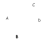
The interface's job is a difficult one; it must display a potentially vast space of pages within a finite screen, and it must simultaneously show their similarities and dissimilarities to aid navigation and search.
The pages it may be asked to display may have many complex relationships. For example, page A may be similar to pages B, C, and D, and page B may be similar in one way to page C, and similar in another to page D, yet share no similarity in common with both pages C and D. This can happen when: (1) different attributes of page A have similar values to the corresponding attributes of pages B, C, and D; (2) the attributes of pages C and D have largely similar values; and (3) page B has no attribute whose value is similar to the values of the corresponding attributes of both page C and page D.
For instance,
pages A, B, and C may all have been created at roughly the same time, whereas D was created later;
pages A and B may also have roughly the same size, whereas C and D may each have much different sizes;
pages A, C, and D may be about roughly the same topic whereas B is about something completely different.

The page database stores similarity vectors for each page, so it can capture complex relationships between the pages. Displaying them, however, is another matter. The user interface must represent all the pages, and hint at all the page relationships that the user might think significant, without turning the display into an unreadable mess.
Since the interface is limited to the computer screen, and is further limited by the human inability to distinguish fine gradations in color and frequency and so on, it must make intelligent choices about which pages to represent when, which relationships to represent when, and how to represent them both.
Currently, it displays icons scattered in an otherwise empty space, with each icon representing one page in the space of pages. Pages with the strongest similarities, according to those attributes that the system thinks the user thinks are most important, are placed near each other, thereby creating clusters of icons.
The interface calculates the distance between two pages based on their similarity. Using the example above, where page A is similar to two different groups of pages, this algorithm should place A near B if the similarity between A and B is stronger than the similarity between A and C or A and D. Note that it cannot simply put A, B, C, and D into one cluster since B is not very related to either C or D.
So now we have clustered icons whose locations help the user see which pages have the strongest similarities. To help distinguish clusters further, each cluster might have its own color (although this might be redundant if clusters are already sufficiently separated visually).
To show page popularity, the interface might change each page icon's size in proportion to its hittage. (Hittage measures how often the user has selected a page, or pages similar to it.) So the more a page has been viewed, the larger the page's icon becomes, and therefore the easier it is for the user to find favorite pages.
Unfortunately, geographic placement, color, and size are insufficient to show relationships higher than dimension 3 or 4. To help the user see more complex relationships, the interface can time-multiplex information much as a radar screen shows trajectories by pulsing consecutive snapshots spaced in time.
As the user mouses over page icons, the interface can dynamically brighten the hue of those icons whose pages are similar to the selected pages and darken the hue of icons of dissimilar pages. So although it may be impossible to show all the relationships between all the pages in one static image, the user can derive some insight into complex data relations dynamically.
Using the example above, when the user views page A, the icons for pages B, C, and D will all brighten, showing their similarity to A. The brightness increase of icons B, C, and D each separately depend on which pages the user looked at before viewing A---that is, the user's most recent trajectory in page space.
If the previous pages were similar to B but weren't similar to C or D, for example, then, prior to viewing A, B's icon would already be bright while C's and D's icons would be almost invisible. Once the user views A, B's icon brightens further, as does C's and D's. So depending on how the user approaches a page, different sets of pages will highlight themselves.
Although using icon placement, size, color, and dynamic hue, is a start, such an interface still can't show all possible page relationships. One simple extension might be for the interface to gently pulse the color or hue of distant pages when the user selects similar pages. Another possibility might be to give various groups of similar pages that aren't already in a visible cluster a unique audible tone so that as the user mouses over the display different tones sound but the same tone sounds for all similar pages, whether they are in one visual cluster or not. The user could then play the interface like a xylophone.
Future versions of the interface might add features to the icons to capture yet more dimensions of variation. If, for instance, the icons were simple faces then the interface could use eye color, mouth expression, hair color and length, and so on, to inform the user of more page properties. Hair length, for example, might represent the page's size (as opposed to icon size, which indicates its popularity with the user), or mouth expression might indicate how recently the user viewed that page.
To capture still more properties and relationships, and to better organize the pages, future interfaces will have to move into three dimensions, and add landmarks, maps, and other navigation aids.