I101: Introduction to Informatics
Lab 9: data analysis (linear regression)
Detailed Instructions for Tasks
Introduction
The aim of this lab is to understand and work with linear regression using Excel. Microsoft Excel has many powerful features for handling data analysis. Data analysis is complex, takes time to perform (as you will learn in this lab), but most algorithms are based on basic statistical analysis algorithms that you have already done in class.
We will be initially working with the basic functions of Excel to perform linear regression, and then using excel tools to do the same. Try to understand how algorithms work, since Excel uses the same algorithm which we will be using.
understanding linear regression
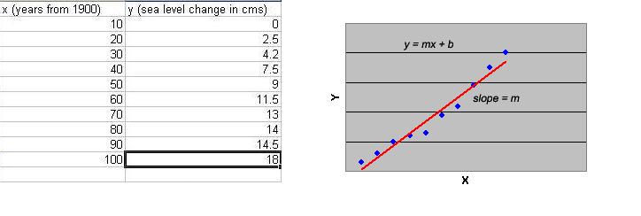
When two sets of data ( x and y )
are related in a linear manner, the data on being plotted ( y versus
x ) gives a straight line. This is known as having a linear
correlation. This follows the equation of a straight line ![]() . Following is an example of a sample data set and the plot of a
"best-fit" straight line through the data.
. Following is an example of a sample data set and the plot of a
"best-fit" straight line through the data.
Instead of plotting the data to determine the
constants m (slope) and b
(y-intercept) of the equation ![]() , we can simply apply a statistical treatment known as linear
regression to the data to determine these constants. The Linear
Regression method will be explained below as an exercise you will perform in the
lab.
, we can simply apply a statistical treatment known as linear
regression to the data to determine these constants. The Linear
Regression method will be explained below as an exercise you will perform in the
lab.
Import Data From Text File
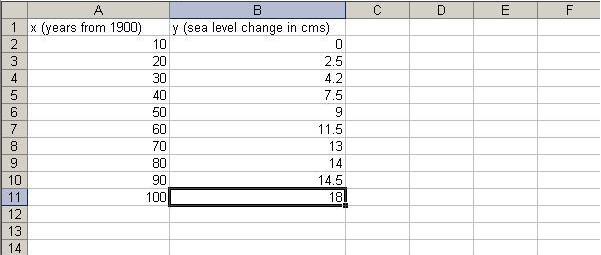
You learned in your last lab that it is just not practical to enter data directly into Excel. For this reason Excel allows you to import data from other sources, in this case, a text file. Please download the data file here and then open it in Notepad.
- Open Microsoft Excel, you should have a new blank spreadsheet open. Save this spreadsheat as lab9.xls. Remember to save your spreadsheet periodically. This is the file you will be turning in for this week's lab.
- Next we are going to import the data
file you just looked at . Go to Data > Import External Data
then find the data.txt file and import it like you did in lab 8.
However, this time make sure you select 'tab delimited' instead of 'comma delimited'. You will see the data in your spreadsheet as shown below.
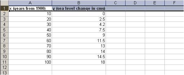
- Next, make the top row bold so we know its our heading and not data. Take
your cursor and click on the 1 on the very left. This should
highlight the entire row. Now go up to your toolbar and click the bold symbol.
Alternatively, after highlighting the row you can simply press ctrl-b. If the top row is now bold, you are ready to start working with the data.
calculate Statistics
We will now calculate the regression statistics which help us plot the best fit line.
For this, we will need to calculate m (the slope)
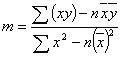

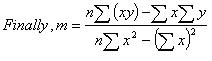
Also, we need to calculate b (the intercept)
![]()
![]()
![]()
We also need to calculate r. The formula for that is
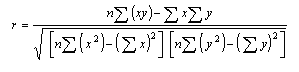
However, to calculate m, b, and r , we will need to calculate a few more things first.
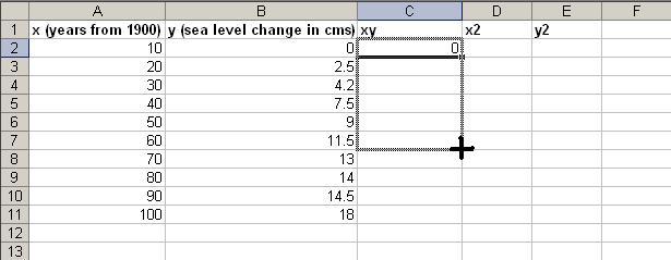
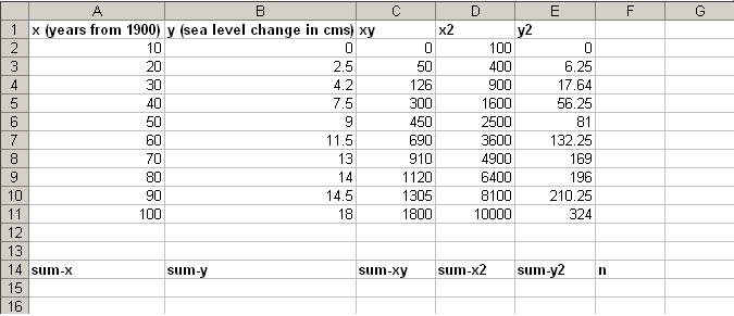
To do this, create column headings xy, x2, y2 in your sheet. Now to calculate these values, do the following:
- To calculate xy, place the cursor in cell C2, and in the
formula bar above, type
Now, to calculate the other values, take your mouse pointer to the bottom-right of the C2 cell, and when your cursor becomes a thick plus sign, drag the mouse pointer down to cover all your data cells. By doing this you can copy formulas for entire columns. In this case Excel knows to formulate the above formula for each row. For example, in the row 3, you can see how the formula now says =(A3)*B3. The power of Excel lies in its ability to automatically update formulas based on which row or column they are in. This process should look like the screen below=A2*B2
You will automatically see that the column gets populated with correct values.
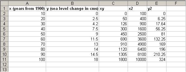
- To calculate x2, place the cursor in cell D2, and in the
formula bar above, type
=(A2)^2
Do the same process as you did in the previous step to now populate column D with correct value. - To calculate y2, place the cursor in cell D2, and in the
formula bar above, type
=(B2)^2
Do the same process as you did in the previous step to now populate column E with correct value. - Finally, your spreadsheet should look like the one below
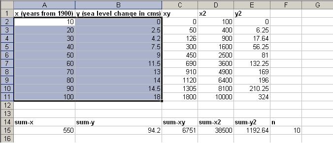
- Now, also create below this data, the fields as shown
- Now, let us calculate the values for the fields we just created.
- To calculate sum-x, go to cell A15 (the one below sum-x) and click the formula button in the toolbar (as described in lab 8), and select the SUM option. Now highlight the area of cells A2:A11 (which represents the values for x) and press enter. The value 55 automatically shows up in the cell below sum-x.
- Repeat the above procedure to calculate the values of sum-y, sum-xy, sum-x2, and sum-y2 .
- We know that n is simply the total number of values. You could just count the values but this would be tedious with a large dataset. Instead, you can put a function to count for you. In this cell (F15), enter =COUNT(A2:A11). Alternatively, after entering COUNT(, you can click the top value and drag down to the last value you want to count.
- You spreadsheet should now look like:

- Now, we have all the required components for calculating
m, b, and
r.
- Using the formulae, calculate the values for m,
b, and r. You can do this
either using Excel, or simply using a calculator.
- First, calculate the values for m, b, and r first using a calculator. Show your calculations and results in the same Excel sheet.
- Then use the functions SLOPE, INTERCEPT and CORREL to calculate m, b, and r using Excel. The functions are fairly simple - use them directly and see how Excel helps calculate the values easier. However, Excel has a lesser accuracy (in terms of number of decimal places).
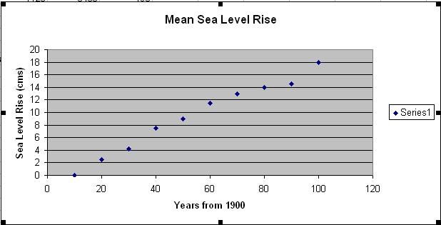
Create a chart for the data obtained
Basic Chart
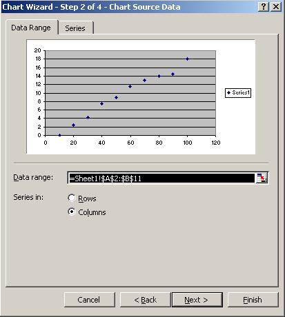
- Let us create a basic chart of the x and y values. To do this, first
select the data values under columns for x and y.
- Now, go to Insert > Chart, or simply press the chart button in the toolbar.
- Select the XY (Scatter) chart option. Select the
following chart sub-type and click next.
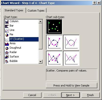
- You will see a preview of how the chart is going to look. Click Next.
- Add your chart title, and Value (X) axis and Value (Y) axis
titles.
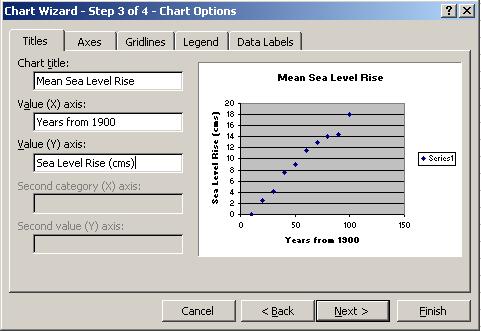
- Just click Finish here. You should now see the graph appear on your
existing sheet.
- Now, click on the Chart option in the taskbar and select Add
Trendline. Select the linear option as shown, and click
OK.
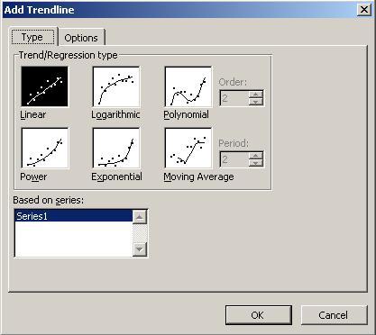
- You will see your trend-line appear on the graph.

using data analysis tools in excel
- We will now see how to do the entire data analysis that you did in the lab up until this point - but using just a few clicks in Excel.
- Within the same Excel document, go to Tools >
Add-Ins... You will see several options, and check the first two
as shown, and then click OK.
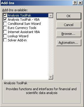
- This has now activated the Analysis tools that are necessary functions to calculate various data analysis tasks, including regression, correlation, etc.
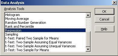
- Now go to Tools > Data Analysis... You will
see several functions here. Select Regression, and click OK.
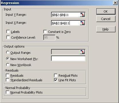
- Select the Input Y Range and Input X
Range as shown, and below, check the Line Fit Plots
checkbox. Click OK.
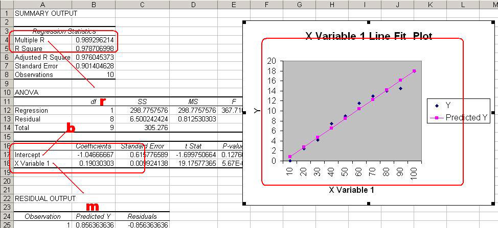
- You will observe that Excel automatically inserts a new sheet in the file. Go to that sheet and observe that it contains all the data analysis you performed (and a lot more things).
- Notice below, the values of m,
b, and r that you
calculated are circled in red in this new data analysis sheet. It also shows a
graph similar to the one you plotted before. Compare the graph and trendlines.
You've pretty much learned how to do the same thing a program like Excel does
for you!
Turn in this file (lab9.xls) in your dropboxes in Oncourse.
Now, use this file - shoesize.txt - and perform the same analysis using both steps (normal, plus using Excel's data analysis tools). You should use a seperate file - shoesize.xls for this, and turn that in the dropbox in Oncourse too.
Also, write a description on your blog, of what you learned in this lab - both about data analysis as well as inductive modeling at large. Get creative! Your score depends on the quality of your post (in a linearly increasing manner obviously!)

