I101: Introduction to Informatics
Lab 8: Intro to Statistical Analysis using Excel
Detailed Instructions for Tasks
Introduction
The aim of this lab is to provide the basic information on Excel which will allow you to import data into the spreadsheet, use it to calculate mean values, and plot two simple graphs using Excel. Microsoft Excel 2003 has many powerful features for handling numeric problems. This lab will to get you started using Microsoft Excel 2003 and will not attempt to cover the complex mathematics required to make full use of all the functions. Microsoft Excel 2003 is a spreadsheet program. A spreadsheet is a powerful application for handling data, mostly numeric data. It is rather like an electronic ledger, which provides a method by which data can be analysed and used in complex calculations. You will find Excel very useful in tasks of data analysis for your group projects.
Today we will be using data from the City of Bloomington about traffic patterns in December 2004. We will look at the volume of cars traveled between certain intersections of 10th street, as well as reported accidents in those areas.
Importing Data From a Text File
Sometime it is just not practical to enter data directly into Excel. For this reason Excel allows you to import data from other sources, in this case, a text file. Please download the data file here and then open it in Notepad. The contents of this file may not look like much now, but it is important data that we will be importing into Excel. So lets get started:
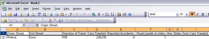
- Open Microsoft Excel, you should have a new blank spreadsheet open. Save this spreadsheat as traffic.xls. This is the file you will be turning in for this week's lab
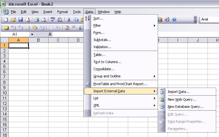
- Next we are going to import the data file you just looked at . Go to Data > Import External Data then find the data.txt file and import it.
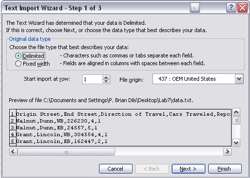
- Make sure that the radio button is selected for Delimited data, the click next
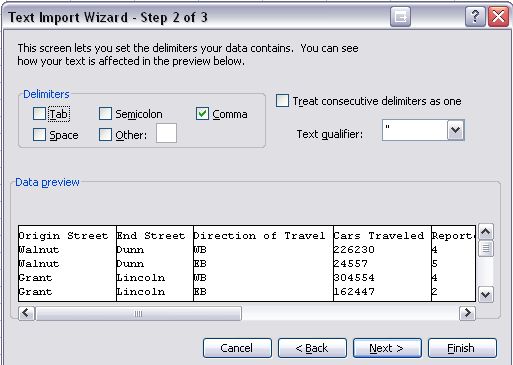
- Check the Comma box and then press Finish
- Next we are going to make the top row bold so we know its our heading and not data. Take your cursor and click on the 1 on the very left. This should highlight the entire row. Now go up to your toolbar and click the bold sybol. If the top row is now bold, you are ready to start working with the data
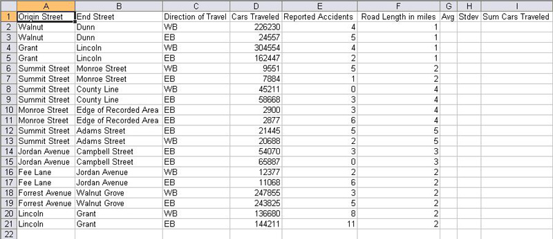
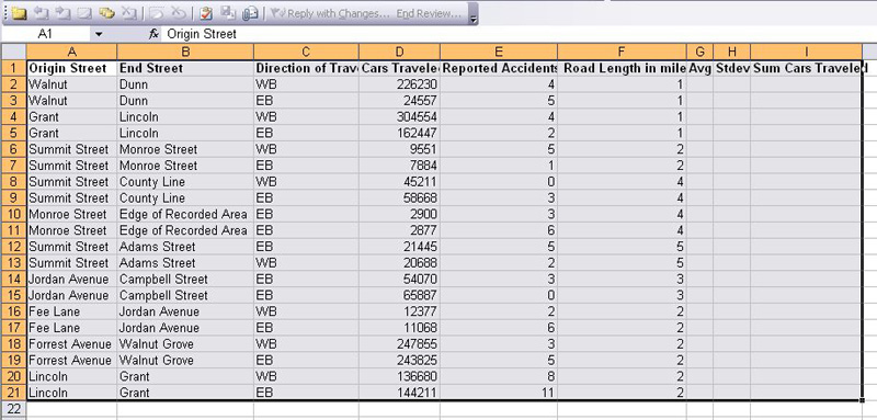
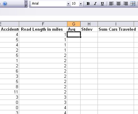
Your spreadsheet should now look like this: Notice Excel has organized all the traffic data into columns with headings. There are also a few blank columns that we will be using later
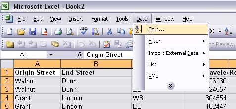
Sort your data
In this section we are going to sort our data using a constraint. Sorting is importantant in Excel, so make sure you get the hang of it.
First we want to highlight all of our data, as pictured below. Note: Make sure not to overhighlight in Excel, this will cause problems later. Make sure you've only highlighted the cells that you need
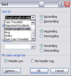
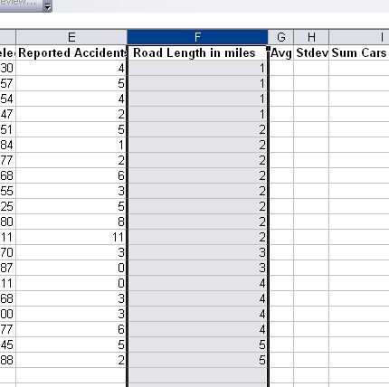
Now we want to sort this data in some way. For this lab we want to sort our data in such as way that the Road Length in Miles is in ascending order.
If you've done everything right, your spreadsheet should look like this:
calculate basic Descriptive Statistics
To find the mean and standard deviation for a set of numbers, we use functions within Excel. You can write your own functions, but Excel has many premade functions for common tasks.
Mean (average)
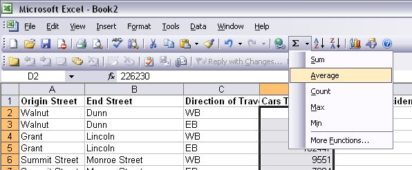
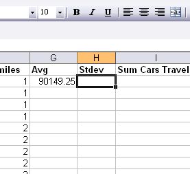
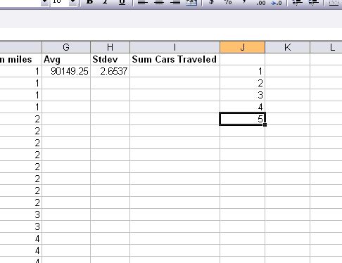
Today we are going to find the mean (average) value of cars traveled in December on 10th Street intersections. This is a large data set with large numbers so the build in funtions in Excel come in very handy. First click into the first cell in column g, the column named Avg
In the toolbar, click on the sigma symbol and go to down to Average
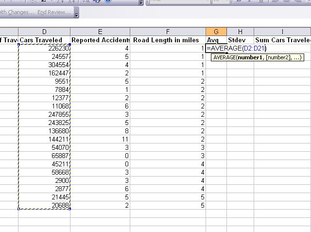
Now to find the mean of the cars that traveled on 10th Street, highlight all the data in column d and press Enter, as pictued below:
standard deviation
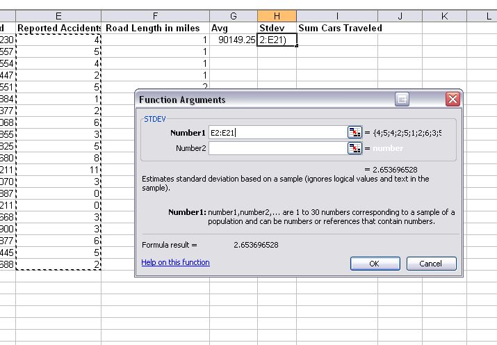
Your next task is to find the standard deviation of the values listed in column e, which are the number of reported accidents at each
intersection on 10th Street. First click into the first cell in column h, the column named Stdev
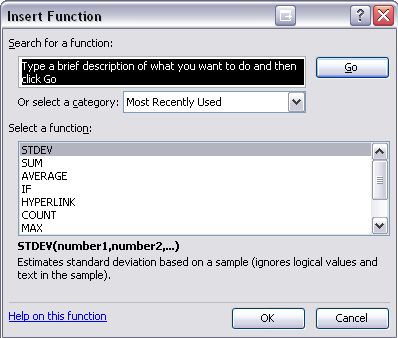
In the toolbar, click on the sigma symbol, but this time go to down More Functions, the select STDEV
To find the standard deviation of the reported accidents on 10th Street, highlight all the data in column e and press Enter, as pictued below:
Create a basic chart and histogram
Using Charts in Excel
There are many functions associated with Microsoft Excel 2003 to help you draw graphs. In this lab we will only do some very graphin. You should take time to work with this powerful software and explore what you can actually do with it. It will stand you in good stead in the future.
You will use chart wizard to draw graphs of your data. It is fairly straightforward and all you have to do is follow the instructions. You will find it easiest if you highlight the data you want to graph before you start.
Creating a Basic Chart
- Select the data from the traffic information that you want to plot, its not important what you choose at this point, we are just practicing. Try to choose one column that contains textual data and one column that contains numerical data. To do this highlight the cells containing the numbers you want to plot. If the rows or columns that you want to select are not adjacent then select the first row or column, hold down the Ctrl key and select the other rows or columns.
- Start the chart wizard . To do this either left click on the chart wizard button on the toolbar or left click on insert and then chart on the pulldown menu.
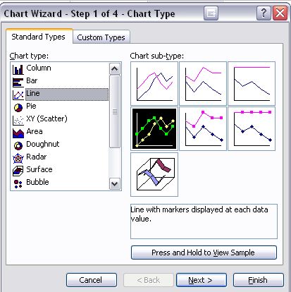
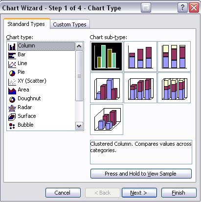
- This will start a series of dialogue boxes. The first is called: Step 1 of 4 Chart Type. The first box should open on one labelled standard types. If it does not, click on the tab at the top labelled standard types. You will see a list of graph types. Choose a chart type from the list, and then choose a sub-type. You can view a description of the sub-types by selecting the subtype. You can preview how your graph will appear by clicking on the button labelled Press and Hold. When you have selected the chart type click next at the bottom of the dialogue box.
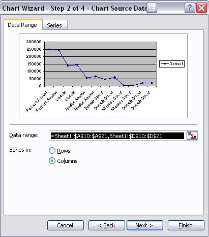
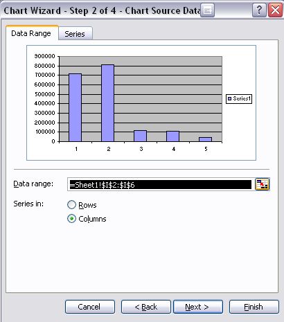
- This takes you to Step 2 of 4 Chart Source Data. You should see a picture of your graph in the next dialogue box and the data range filled in the box beneath the picture. If you did not highlight your data, there will be no information in the data range box and you need to fill this in. The easiest way to do this is to click on the button at the right end of the box (the one with the red arrow) to move back to the data sheet. You can then highlight the data you want to plot. Click on the datasheet button (the one with the red arrow) to return to the dialogue box. The software should also have automatically detected whether your data is in rows or columns. The selected option will be indicated by a ?? If it has got it wrong - click in the appropriate circle. Then click on next to move to the next dialogue box.
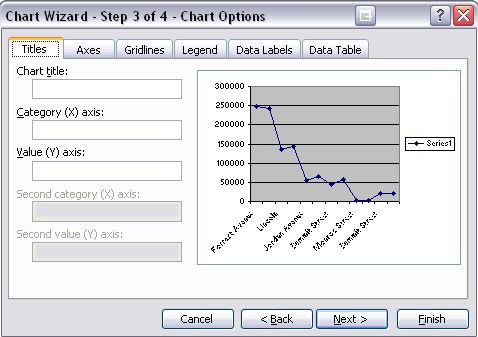
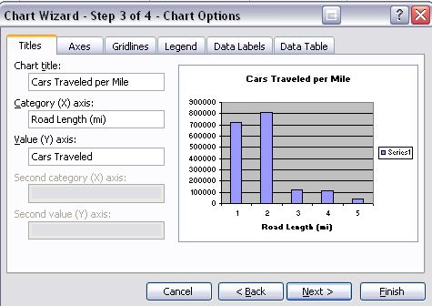
- This is Step 3 of 4 Chart Options. This is where you make your graph look pretty. It normally opens with titles tab at the front. Here you can enter the title for your graph and the labels for you axes. Do not forget the units. Some options: Click the gridlines tab and you can add or remove gridlines. Click the legend tab then you can position the legend or remove it completely. You do not need a legend in this session. Once you have finished, click on next, this will take you to the final screen.
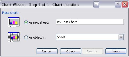
- In Step 4 of 4 choose As New Sheet and type the name My Test Chart in the box next to it. Click on Finish.
Changing the Background
I prefer clear backgrounds to my graphs and, as you will find, the default is grey. You can change this by selecting the background object and double clicking on the background of the graph. A format plot area dialogue box opens. You can change the borders to none and the area to none
Formatting the Axes
When using a black and white printer it is better to format the axes in patterns because it helps to make different series stand out when you have more than one series of Y values. To format the axes you must first select the axis object then use either right click or double click to bring up the dialogue boxes.
Creating a Special Chart called a Histogram
A histogram is called a column chart in Microsoft Excel 2003. It shows data changes over a period of time or illustrates comparisons among items. Categories are organized horizontally, values vertically, to emphasize variation over time. We will plot a histogram that shows the amount of cars traveled against the length of the road. For this this histogram we will need to find the sum of all cars traveled per road length, then we need to graph this data:
- Before we get started, we need to make some labels in column j. Starting from the second row down, enter the numbers 1 through 5 as pictured below:
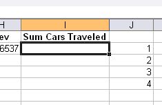
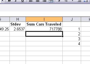
- Next click into the first row under the Sum Cars Traveled column
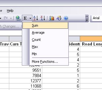
- Now insert a function much like you did in the previous section with mean and standard deviation, except this time we are going to be using sum.
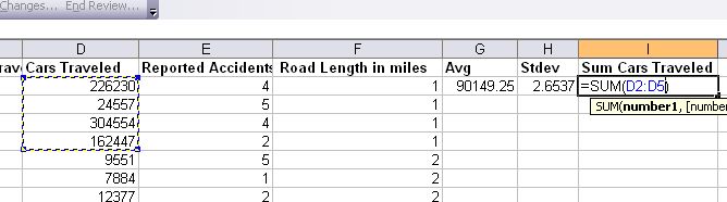
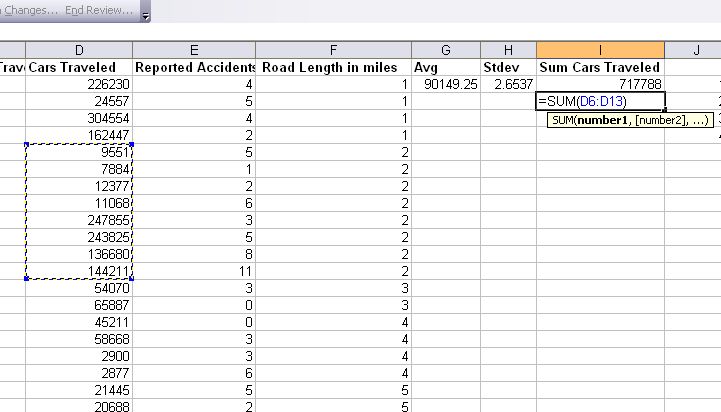
- The columns we need to highlight to sum are the ones in column d that have a value of '1' in column f, then press enter.
- If you've done this correctly, the sum should appear in column i next to the number 1 in column j, as pictured below:
- Now go to the cell below, next to the two, and insert a sum function like you did in the previous step. This time, however, we are summing the numbers in column d that have a road length of 2, as pictured below:
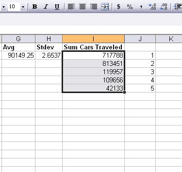
- Repeat this same process for road lengths of 3, 4, and 5. Your spreadsheet should look like this when you're done:
- If everything looks good, we are ready to graph our histogram. Highlight all the data in column i, not including the heading
- Start the chart wizard . To do this either left click on the chart wizard button on the toolbar or left click on insert and then chart on the pulldown menu.
- This time we want to choose a Column chart, then click next
- Click next on step 2
- In step 3 we are labeling our chart and the axis. Make sure you always label with units also. The Chart Title should be "Cars Traveled per Mile", The X axis should be called "Road Length", and the Y Axis should be called "Cars Traveled". Click next.
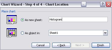
- Make sure you choose to make this chart a new sheet, then name it "Histogram". Click Finish and you should now have a Histogram
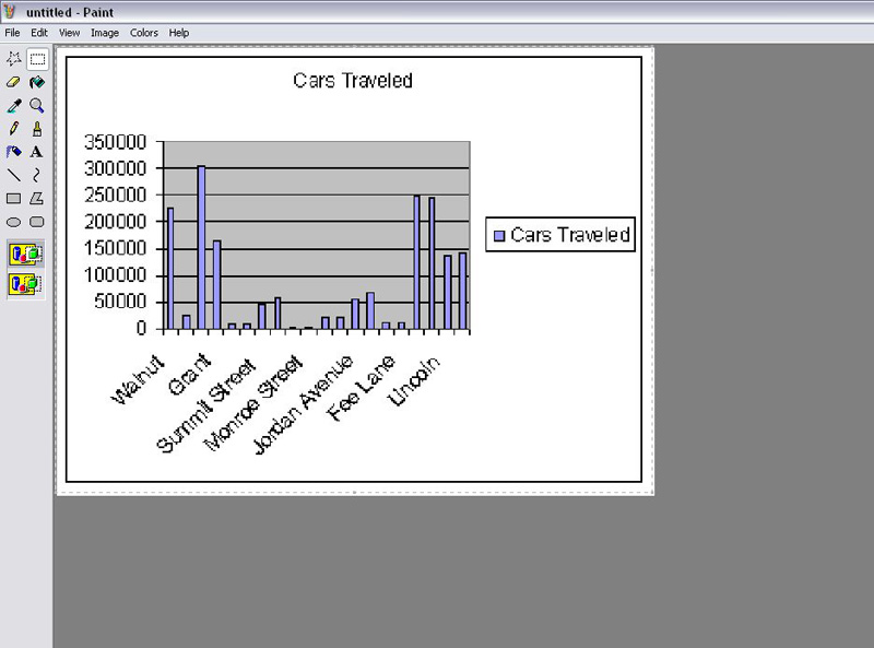
- Right click on your new Histogram and Click Copy.
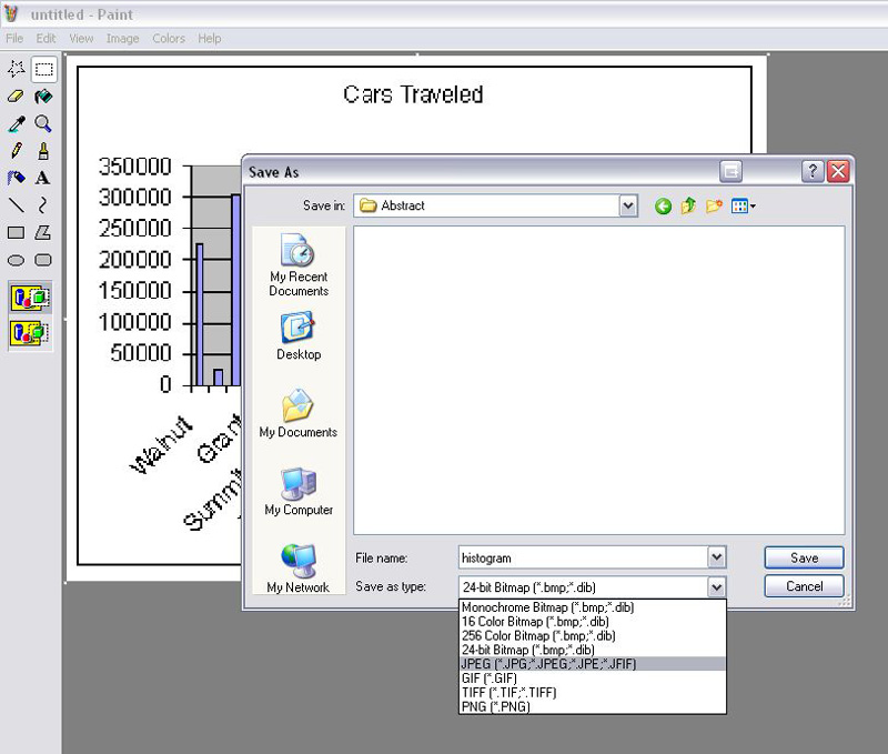
- Open Microsoft Paint (or your favorite imaging program) and Press CTRL + V, to paste your image onto the canvas.
- Now we need to save this file for the web. Go to File > Save As and save this file as Histogram.jpg, you need to use the drop down menu to find the .jpg format because Bitmap format is the default. Upload this file to your web site, and post the image on your Blog commenting on the lab
- Save your spreadsheet as traffic.xls and you're all done with the lab! Please upload your Excel file to the Lab 8 dropbox on Oncourse.
Check that you have completed your deliverables before you leave.

